This blog post was drafted with ChatGPT Codex and edited manually.
Login screens in React Native look simple from the outside: a couple of TextInput components, a button, maybe a password reset link. In practice, they sit right where app code meets native platform behavior. Keyboard return keys, password managers, one-time code suggestions, font rendering, Android autofill overlays, iOS content types, and accessibility all show up in a very small amount of UI.
This branch is an Expo-focused polish pass on Consemble’s auth flow. The goal was not to rebuild authentication. It was to make the existing sign-in, sign-up, forgot-password, reset-password, and verification-code screens feel more native, more consistent, and easier to maintain.
Before and After
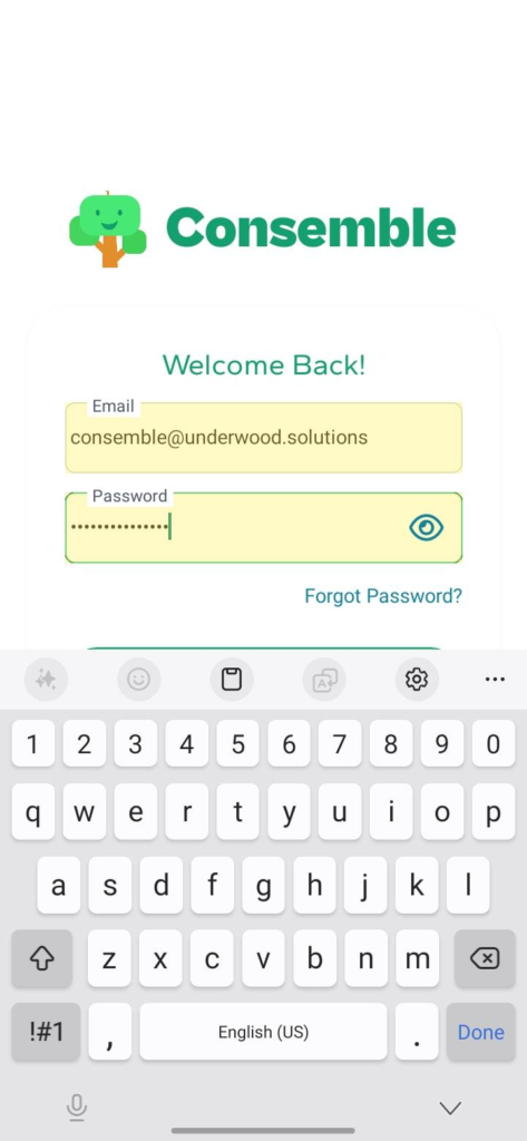
The old login screen worked, but the input treatment felt closer to a default form than a finished mobile auth experience.
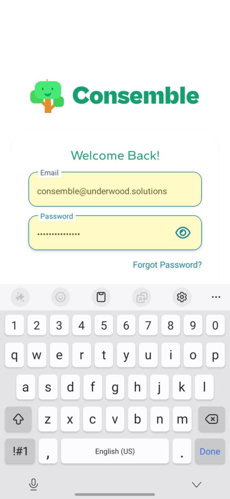
The updated screen keeps the same flow while giving the inputs clearer focus states, more breathing room, a stronger floating-label treatment, and better native password-field affordances.
Improving the Shared React Native Input
The main change is in the shared FloatingLabelInput component. In React Native, the native TextInput is not always the best place to carry every visual concern. This update moves the border, background, clipping, shadow, and animated focus border onto an Animated.View wrapper, while the TextInput focuses on text entry.
That separation makes the component easier to style and gives the input a more deliberate mobile feel:
– The border color animates with Reanimated as the label floats.
– The focused state uses the brand turquoise.
– The input surface has a subtle native shadow and rounded shape.
– Android gets underlineColorAndroid="transparent" so the default platform underline does not leak through.
– Android also gets textAlignVertical="center" to keep text placement stable.
– Password fields reserve space for the visibility toggle so text does not run underneath the icon.
– The visibility toggle now has a larger touch target, accessibilityRole, and an explicit accessibility label.
Because this input is shared across the Expo Router auth screens, the same improvement applies to sign in, sign up, forgot password, reset password, and verification code entry without duplicating styling logic in each route.
That is the difference visible in the screenshots above: the new login screen is still built from the same auth primitives, but the shared input now carries more of the visual polish expected from a native mobile form.
Giving iOS and Android Better Autofill Hints
React Native exposes platform-aware input hints through props like autoComplete, textContentType, keyboardType, and returnKeyType. This branch adds those hints throughout the auth flow:
– Email fields use autoComplete="email" and textContentType="emailAddress".
– Existing password fields use autoComplete="password" and textContentType="password".
– New password fields use autoComplete="new-password" and textContentType="newPassword".
– Verification codes use autoComplete="one-time-code" and textContentType="oneTimeCode".
– Return key behavior now matches the next action in each form.
These props are easy to miss, but they are important in an Expo app because they tell the native OS what kind of credential or code the user is entering. That gives password managers, saved credentials, one-time code suggestions, and software keyboards better context.
Handling Custom Fonts in Native TextInput
Consemble uses the Gantari font through Expo font loading and NativeWind classes. The branch keeps the font-gantari class, but also sets fontFamily directly on the native TextInput and floating label.
That extra explicit style matters because TextInput is a native component, and font behavior can be more fragile there than in ordinary Text nodes. By applying the font directly, the intended typeface is preserved for the actual input value and label.
There is still one platform caveat: Android and Samsung autofill suggestion UI is rendered by the operating system, not by the React Native view tree. That overlay may use the system font because the app does not control its rendering. Once autofill commits text into the field, the value renders inside Consemble’s input using Gantari.
That limitation is now documented next to the input styling so future changes do not have to rediscover it.
Keeping Shared Styling Maintainable
The shared input previously had several inline color values for focus, placeholder text, labels, shadows, and selection color. Those values now live in named constants at the top of the component.
That is especially useful in React Native because component styles often mix class names, inline style objects, platform-specific props, and animated styles. Keeping the color vocabulary in one place makes the shared input easier to review and safer to change later.
Why This Matters in Expo
Expo makes it fast to build cross-platform screens, but the final layer of polish still depends on respecting native behavior. A login field is not just a styled rectangle. It is a native text control, a keyboard participant, an autofill target, an accessibility element, and a password-manager surface.
The result of this branch is a login flow that behaves more like a careful mobile app:
– Inputs respond more clearly to focus and filled states.
– Password and verification flows get better native keyboard and autofill support.
– The shared input carries its own native font and platform-specific details.
– Auth screens get consistent behavior through one reusable component.
– Android autofill font behavior is documented as a platform limitation.
– Styling values are collected where future maintainers can find them.
Good React Native UI polish often lives in details like these. When the front door respects the platform, users can get into the app without thinking about the mechanics of signing in.
Leave a Reply